Thursday 30 January 2014

Phase 1 Drawing Experiment and Isadora - Progress

So, I've already mentioned in earlier posts about this experiment that I'm doing, and one has seen that I've been messing about with the aesthetics on Photoshop and planning a rough timeline of significant events regarding it (although this keeps getting pushed back due to other work commitments). Well, I've stretched the old large-scale-drawing muscles and replicated Phase 1 with a pen and something with a big straight edge (I currently don't have a large ruler, as I keep losing them for some reasons) - this being a flat wooden MDF board. 


After being vaguely satisfied with the amount of lines and mundane labour I've put into the above, the untouched areas were cut off and I now had a full square of lines. But when I thought about it, I could have just replicated Phase 1 through some bigger printers at Nottingham Trent.

Anyway, the following week, I went down into the sound studio at the basement of Trent (what I referred to as the 'Isadora studio') and revised what I had previously learned from the inductions I had back in November.


So far, I've been powering through the tutorials I mentioned in the last post about Isadora, where it all came back to me quickly. The most significant part I've yet to reach yet: live video, which is tutorial 8 in this YouTube series. So far, I've learned how to use and manage multiple scenes on the software, looked at ideal methods of practice, applying and controlling scale and using the effects that come with the software (there are other, open source plugins that I can use, but I've yet to experiment with them).

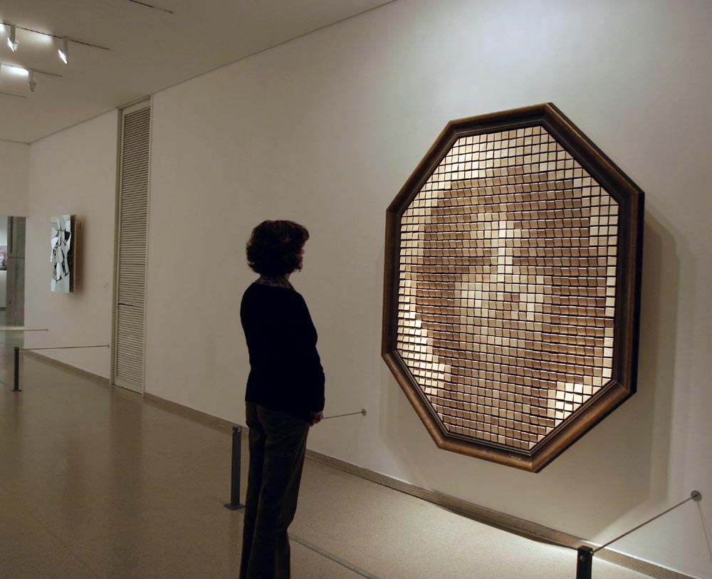
As I have mentioned, the goal of the lined drawing is to make it into something reactive along the effects of warping upon a viewers approach. I haven't yet decided which might be more ideal in terms of physical application: touch interface or reverse projection coupled with motion sensors/cameras. I'll continue to reflect on this as I progress.

Tuesday 28 January 2014

Hello Processing, and my first visual "programming" attempt.

Eventually, I had to get down to the nitty gritty of programming and see what was powering all those pretty interactive graphics and interfaces. This is an ongoing endeavour through processing.org, where I've downloaded the free software application onto my home computer and MacBook. For the most part, I've been doing this on my home computer.

I already had a vague understanding of java and html, as well as formulas that I often used in excel (as a result, I had a love-hate relationship with excel because formulas confused the hell out of me, even during my ECDL course), but the appeal of the Processing,org is primarily focused more on the visual and far more engaging in terms of tutorials and guidelines. Hello Processing, for example, somewhat refamiliarised my knowledge and understanding of basic programming and broke it down with such simplification, but it's not entirely the same as what I was doing on, say, vampirefreaks ten years ago. But you could say I owe it to the social network for introducing me to HTML and CSS, as the initial appeal of the website for me was the freedom in how someone with practically no experience of programming can code his/her profile to look. It was the same case with myspace when it was extremely popular around 2006-08.

I would be lying if I said that coding wasn't a bit dull, but it depends on the end result you're aiming for. I don't know how to build a website from absolute scratch (yet), and the tutorials can at times be daunting. But that really is just me. I suspect that a better way to go about doing this is diving right into it in the most practical way possible. The LightNight project I've mentioned in earlier posts will be a good way of the deep end, and I also have my own project to consider in this respect.

Suffice to say, here is a practice example of programming:

At this point, I acquaint the relevance of this example to my Learning Agreement project in respect to my drawing experiment. There is still a lot to address when it comes to physical application, but I'll be wrestling with that in the Isadora basement at the Trent Bonington building this week (hopefully tomorrow). 

Thursday 16 January 2014

AllofUs - Interaction Design and User Experience agency (and the current reflection of my working life)

I attended this lecture yesterday at the Waverley Building. It was a lecture by an interactive designer from AllofUs; a leading, award-winning interaction design and user experience company with a clientele of some of the biggest international companies.

This was a project they did with Carte Noire:


The software for the piece was developed using openFrameworks. It was explained in the lecture that the video was captured from a security camera at a full-HD resolution of 1080p at 30fps using a Blackmagic Intensity Pro PCIe card. Motion in the scene was detected and analysed using openCV, specifically blob tracking and optical flow algorithms. This input, along with colour analysis and proximity was used to allow users to interact with the effects.

The lecture also highlighted another project which used the Xbox Kinect, as building a touchscreen in these shapes would have complicated things a lot more:


Mishkat Centre was commissioned by the King of Saudi Arabia to encourage and educate today's Saudi youth about the advances and benefits of atomic and renewable energies. So, they approached AllofUs about a concept and design to bring the exhibition together. The agency came up with these "wave tables" that were calibrated in real-time using Xbox controllers, which seemed to be very tricky in terms of meeting that specific physical space. Still bloody impressive, though.

Current Reflection
I've been hearing sketchy details about placements by the end of this course, and AllofUs seems to have my attention in this area. The agency strikes me as an ideal avenue to pursue work experience within interaction design... assuming I can get over the fact they're based in London and work around it by September.
At this point in time, I'm set up for training as a healthcare worker in February, which is going to take a chunk of academic time from my schedule (two weeks, approximately). I'm also hoping to regain a foot back into the NHS, mainly because it largely entails secure work of a venerable nature with decent, progressive pay (although the quality of pensions has been politically savaged as of late), and huge benefits of personal development which I intend to continue in order to eliminate this horrible, existential limbo of impoverished studenting.
This is not to say that I want out of the creative industry. Far from it! That's why I went into this course in the first place, because I felt like I was no longer a part of that (plus, job prospects are utterly shite)... but I certainly did not want to approach it through the avenue of Fine Art. I'm no longer interested in making something purely for expression and aesthetics. I'm largely done with that and would prefer to make it in my own time. Nowadays, I want people to like and engage with the work I make. I want to create things like AllofUs have.

Monday 13 January 2014

Lecture on Inclusive Design and Disability, by Julian Wing

Tonight, I attended the first lecture back at Nottingham Trent this year:

Julian Wing focused on issues facing disabled people and their access to goods and services, particularly clothing. It also highlighted the changes over the years since the introduction of the Disability Discrimination Act (which should have improved access to goods and services for disabled people in the UK) and discussed some of the research that is now taking place that is focused on 'inclusive design'. 

Julian presented some of his experiences and thoughts from the Awear UK project, which aimed to challenge preconceptions about disabled people and their place in the fashion arena. Through the lecture, Julian made all in attendance aware of how powerful a group disabled people can be as consumers. It is still, astonishingly, a largely untapped market. This wasn't just limited to people with physical conditions, but those with mental impairments as well. 

What I found strikingly interesting was the amount of ethical consideration one needs for these sorts of projects and subjects, especially at postgraduate study. My own project does not include many ethical factors beyond considering those with conditions like epilepsy, and informing those in the public space of film recording. The spaces I would occupy for my work are likely to already cater for those with physical disability. But after seeing this lecture, I've decided to draw more on these ethics in terms of my project proposal and inclusive design, which may go to reach out to a largely untapped audience.

Friday 10 January 2014

Research & Context module Presentation, and Prezi

So, I had my presentation about the first module on Wednesday... which may go to explaining why I've been twice as active this month. I could be wrong about that, though; it might just be the Christmas cabin fever. Suffice it to say, my work and presentation has made me a lot more active (last night only involved four hours of sleep).


These are a few screenshots from the presentations, which I have put together in a PowerPoint document. The feedback was good, but brief. This is most likely my own fault for going beyond the duration of 15 minutes to leave time for Q&A in the last 5 minutes. There was a lot of content that I collated from this reflective journal, learning agreement and secondary resources. That and I might have been talking too slow.

I highlighted my first and second case study, my research question and some developing plans as to how I'm going about this project, which mainly involved the drawing experiment in 4 phases, two extra case studies, and more user surveys.

Prezi
Now, my own presentation aside, I was watching the presentation of others. One of the students had put her presentation together using a software called Prezi; a presentation tool that uses Zoomer User Interface (ZUI). I spoke to the student afterwards and asked about this software, and I believe that for my next presentation (because I know they'll be others in this MA), I may give Prezi a crack to see if it better illustrates my project. If I'm honest, the Prezi presentation I saw from this student made mine look quite bland in comparison.

Tuesday 7 January 2014

Videos to better illustrate Camera Obscura


I've put this video on here to better illustrate the content at Camera Obscura. The video below is a video I took of a friend walking through the "vortex tunnel."


Phase 1 of the Drawing Experiment.

I am at this stage aiming to make a practical, creative experiment in January in order to test the comparison of spectator reaction to the traditional drawing vs. interactive drawing which I believe will be the first evaluative milestone to this project. This involves liaison with lecturers and technicians in the school of art and design.

There is an increasing emphasis on the gallery space, so I intend to use the Boningtion Atrium for experimentation. The main idea I have now is to display an abstract drawing which will like an overall motion or ‘ripple’ (generally applied to larger scale, such is my drawing style), then produce that same drawing or a very similar one which will react fluidly to people who pass by or get close to it. This is perhaps best done in phases. The first drawing will be abstract; the second will be less abstract (with a suggestion of a face in said ripple; the third phase will take on the abstract but in a reactive approach where one viewer can trigger the ripples in close, moving proximity; the fourth may take on aspects of the second phase and act as a mirror to the spectator. I intend to evaluate this based on my observation of the spectators and their own reactions. Perhaps I can even tally how many people stop to view the traditional media vs. interactive, but it is more important to annotate how they react.

So far, I am experimenting with Phase 1. I have scanned and experimented with this image on my own computer, particularly in Photoshop:

This is the original image of basic lines; the starting point to Phase 1


An example of warping the image to give it a 3D impression


And another.


And this is how it generally looks when I'm playing around with it on photoshop.

At this point I aim to replicate the experiment in large scale, display it in the Bonington Atrium as an easy start, then as I have said record and evaluate the reactions. With ethical considerations, I will do this by filimg for one or maybe two hours from a sedentary position which will be out of the way but with the work in viewing range. Keeping out of the way is important as it serves to allow those viewing the display to make their own interpretive reactions without explicit influence, although now that I think about it I wonder if I would be close enough to hear spectator comments.

Monday 6 January 2014

Second case study: Camera Obscura (over Christmas)

Over the Christmas, I went up to Edinburgh with a few friends. We stayed up there for a few days and spent our time there by wandering around Arthur's Seat, going on a few ghost walks, looked around Edinburgh Castle, ate haggis and black pudding, drank, and most interestingly went to an exhibition or two. Now, I've already been to said show in the post's title, but because I enjoyed it so much last time a few years back, I thought we'd go again for the sake of what I was studying at MA level. Camera Obscura is a museum of optical illusions on various scales. I regard it as one of those very few exhibitions one can engage on a thought-provoking and enjoyable level at the same time.

Here are some of the pictures:

These two are of the mirror maze we went into, and the only explicit instruction at the beginning of this experience requested that we wear protective gloves (to avoid the finger marks on the mirrors). The only hazard one can perceive here is walking face-first into a mirror, hence using your hands to feel your way through.


This was an interactive piece that involved painting the screen with a light source onto the screen.


Possibly my favourite part. Once you walked onto the bridged platform, your orientation swirls as you try to find your balance, hence the railings. A lot would understandably find this experience nauseating, but I would of course find it seamlessly engaging (given that I kept going through it repeatedly).


This box didn't have many dimensions, but mirrored them into many more with light and reflections. If one took a look inside, the "ripples" or "waves" would go on indefinitely.


A phosphorescent wall from light photography. What happened was that you posed in front of the light, step away and find that your shadow has now been printed onto the wall.


The museum consisted of five stories of optical illusion and interactive art, and celebrated those in the 20th century as well as the 21st who delved into this type of practice and insight into playful perspective. 

This marks my second case study in the form of a short holiday away from the East-Midlands. The overall point to my project as it stood over the Christmas period was to find out what made an interactive experience in a gallery environment seamless, and investigate the problems and hazards involved in facilitating such visual endeavours. I addressed a few points and flaws already in my previous case study on Ali Northcott's Embody performance; in this one I looked for the elements that made it seamless.

Comparing the two case studies
Granted, the two case studies are quite distant from each other in terms of time and scale. Embody was a schedules, temporary performance whereas Camera Obscura was permanently established and installed. Embody only occupied a ground floor setting that was temporarily altered to facilitate its content. Camera Obscura has a five stories of space and endures seasons of visitors due to its status as a main tourist attraction on the Royal Mile in Edinburgh. 

Drawn Conclusion
There is one possible conclusion that I have drawn out from this particular holiday: A seamlessly interactive experience may point to a solidly established show; that functioning like a museum. Exhibitions and museums I note are far from the same. A permanent collection of certain works I think would have had a huge amount of time to be improved, added to, maintained and promoted. A performance or exhibition in a temporary space works to far tighter deadlines when being set up and taken down; it also would have had temporary invigilators if not for the chosen venue's own staff if it had any to take care of the work and apply whatever facilitation in order for the show to function, especially on a single night of performance. There are of course rehearsals to rectify the uncertainty, but it also depends on availability, quick organisation and probably funding. So, it would be paramount to take on those who know exactly what they are doing. A permanent exhibition like Camera Obscura has a lot more time, breathing space and most likely more staff for this. 

Introduction to Isadora

I mentioned in an earlier post about my time playing on Isadora. This has better worked on my MacBook Pro, although I am slightly limited as to where I can do this due to currently having no battery pack for the laptop. It serves better than my desktop computer because it is equipped with a more efficient camera interface, and that enables more experimental engagement with the software. 

Here is an example of an effect you can add to a videoclip:


You can also use it to create effects that react to sounds as well as camera images, much in the same principle as Daniel Rozin's Wooden Mirror. This avenue of my project has been emphasised repeatedly throughout this module, and will probably extend into the others. So at the moment, I'm currently progressing through the tutorials on YouTube, mainly this series by Troikatronix:


A Unified Theory of Design


Nathan Shedroff has also been another source material that I've been reading up on over the Christmas, as pointed out in one of my tutorials before. He offers a unified theory of  information, interaction and sensorial design. As one can see, it has been represented through a Venn diagram, illustrating that one encompasses the other and vice versa. However, it is not just limited to this framework.

According to Nathan, the three disciplines are defined as follows:
  • "Information Design addresses the organization and presentation of data: its transformation into valuable, meaningful information. While the creation of this information is something we all do to some extent, it has only recently been identified as a discipline with proven processes that can be employed or taught."
  • Interaction Design "is essentially story-creating and telling, is at once both an ancient art and a new technology."
  • "Sensorial Design is simply the employment of all techniques with which we communicate to others through our senses."

Information Design does not replace that of graphics and other visual design, but rather it acts as a larger structure in which these types of disciplines are expressed. As mapped by this continuum, we see the extensive relationships between data, information, knowledge and wisdom.

The Continuum of Understanding

We start with the least useful understanding in the continuum: data. It is generally not seen as a product of communication because most of us won't be interested in raw, abstract findings. However, it is first and foremost the product of discovery for the designer. Contextualising this outlook with my academic background in Fine Art, I wholeheartedly agree. The backing work and research that one often produces for assessments in support of the final product, i.e. the finished artwork installed and exhibited. The backing work will only serve as clutter after the ouvre has been marked. Usually, the backing work is withdrawn and the final product remains to be presented in public view. I usually get iffy when I see a sketchbook or a pile of papers near an exhibit. It suggests to me that the artwork itself will not work alone without the rough backing work, and I find that I frown upon that. A sketchbook can be nice at times, but when attending an art exhibition, I wish to make the interpretation of the final pieces themselves and not have developmental litter obscure it. Artist statements I'm a bit more lenient about.

Anyway, data then becomes information when it is collated, organised and presented in a context that delivers more coherent patterns and meanings. The data is also determined in what is the most appropriate information that can be presented (and in my arty view: the artwork itself, and maybe a definitive statement). 

Knowledge is then produced by the incorporation of information with our existing understanding and in this continuum is the participatory stage of communication. But it can only be communicated through persuasive interactions that allow people to recognise the patterns and meanings in information per se.

Wisdom, right at the end of the continuum, is perhaps the most abstract of all understandings. At this word, I can only imagine a viewer stopping to look at an artwork in a gallery, interact with it maybe, break down and weep tears of joy/sadness in the grip of an overwhelming revelation. As described by Nathan, wisdom is "the 'meta-knowledge' of processes and relationships gained through experiences. It is the result of contemplation, evaluation, retrospection, and interpretation--all of which are particularly personal processes." It is hard to share this kind of understanding, and we certainly cannot create it like data and information. Wisdom is solely for the individual, which is why another could never comprehend what the weeping spectator is going through. I think this is where emotional design would come in. An experience I can relate to this understanding may come through the 2012 game, Journey (see previous posts on video games).

Organising
Organisation is the crucial element into collating and arranging data into information for effective communication. This process determines the impact in which it is understood by others. There are many ways of organising data into comprehensive information, depending on what context they're in e.g. time sequences, alphabetical, numbers, etc.

Interaction Design focuses on the creation of experiences that are effective, helpful and appropriate. Looking at my own course, Interaction Design is mostly under the umbrella of the Performance Arts, considering that some of my lessons are shared with those doing Puppetry, Animation and Film-making. On my part, Performance focuses more the interactivity of products and designs.

Nathan has again provided another continuum of this discipline:

The Continuum of Interactivity

Feedback in an interactive product would enable the person to perceive his/her actions when engaging it. This can be related to control, as people at this stage control what happens to the response of their interaction.

Creativity and productivity are also related aspects of the continuum. For example, if you remember me linking Silkweave a few months back, you'll find that I also posted a few examples of what others had created from it. A quick google search can yield a lot more. Higher interactivity basically helps more in creative and informative endeavours; especially artistic ones like Silkweave. Simply put, creative interactivity means more creativity. Productivity can be said for, say, any musical instrument when learning to play one. I'm currently learning the piano, and have a proper chair, stand and keyboard that behaves exactly like an authentic piano to learn, and eventually compose my own music (once I get the hang of music theory).

Communication is where we interact with others, and is such a broad spectrum of anything in Performance Art. One shares experiences, stories and opinions with others in this light. It can happen at an exhibition, a musical concert, a multiplayer video game, the telephone, cocktail parties (as Nathan describes) etc. 

Then you finally have adaptivity. This is where the technology that changes the experience based on the behaviour of the user, which include agents, which "are processes that can be set to run autonomously, performing specific, unsupervised (or lightly supervised) activities and reporting back when finished. Modifying behaviors are those that change the tools and/or content involved based on the actions of techniques of the user." This is very apparent in video games, where the levels get harder as the player becomes more proficient and progresses further. 

Another way to illustrate adaptivity is through Nathan's Experience Cube:

The cube basically maps feedback and control as a single-dimension, with creativity, productivity and communication grouped in another. Adaptivity remains in its own dimension.

Sensorial Design simply encompasses all categories of those disciplines involved with the creation and presentation of media. It includes any design undertaking associated to the purposeful stimulation of senses.


I have interpreted this information mainly from Information Interaction Design: A Unified Theory of DesignA far more detailed insight into the Unified Theory of Design can be found here in nice, crispy pdf form. 

A few points of the MA Scale Up sessions

If I am completely and uncompromisingly open about this particular series of sessions, I hated almost every moment of each one. Apparently this has turned out to be an experiment in the MA program, which I don't really appreciate either, as I'd prefer a straight-up, definitive learning slap from the tutors who know a session is going to work and yield nothing short of a tear-inducing epiphany. Too romantic? Hopelessly. Other tutors I have spoken to about this frustration (which is not only on my part, but felt by pretty much every other student), have let slip with a pause and said "it's, uh... an interesting experiment." - I'm reading so hard between the lines on that with bitter amusement. 
However, there were some particular things salvaged from the session that got me thinking about what is to be expected from the learning outcome, particularly from this Research & Context module. All of these things are asked in my Learning Agreement anyway, but I suppose the fresh thing about them is that they were addressed in the Scale Up sessions in more open discussion. These were (and my answers to them):


Demonstrate potential for advanced research: 

I might interpret this as the rationale for my project. What is the significance? This is a research that I think would delve deeper into the human understanding of a topic or question, which presents potential to add something to the overall knowledge of the subject, and that in nutshell can be applied to anything.


Ability to conduct advanced research independently: 
I'm uncertain as to what one means by “advanced.” How advanced are we talking? That has always been a vague word. In the context of research, I once asked Nancy Hughes about her perspective on working as a Research Fellow or anything else related. Other than the fact that it's hard work to get into, there are a wide range of research techniques one can pick up on and a range of terminologies to become familiar with. Types of research, albeit independence, can be audience or production. There's the matter of primary and secondary research. Primary being the observations I've made first-hand, and secondary entailing information from sources like books or the internet. I guess advanced might mean a lot more of the primary kind.


Demonstrates your comprehensive understanding of research methodologies, techniques, ethical considerations and personal development needs: 
Again, referring a lot to my learning agreement, a reflective journal will demonstrate a lot of these via pictures, videos, writing (sometimes on paper), referenced works by others in the field, case studies (one such that I have done already in the Performance Arena), interviews with various practitioners in the relevant field and context, discussion with other people in a group/meeting etc. 
Ethical considerations can almost entirely be a different animal, depending how one conducts this research. In my case, I've referred to the appropriate protocols and Nottingham Trent provided. The only time I had to do this was when I was considering whether or not it was appropriate to film those reacting to my artwork without their knowledge. But then, this is easily rectified by a sign informing those that filming is currently taking place in the public space.

As far as I know, the Scale Up sessions are now finished, and theory has largely been moved out of the way for the practical side of everyone's projects. 

Physical Computing

Often defined as the study of technology that allows computer input and output, or in my more relevant sense building interactive physical things that function on hardware and software, physical computing is what I will start to use on a regular basis if I am indeed to establish myself in the digital arts.

Artists, in the broadest sense, use any means of expression with any medium available to them. Developing technology is no stranger to this process, and therefore proliferates in so many forms. Artists will approach developing technology with the same curiosity to all traditional mediums, and will find the same urge to communicate ideas.


I had a few lessons on this, which involved demonstrative use of the Arduino single-board microcontroller, an open-source electronics platform for artists, designers and hobbyists creating interactive objects and environments. The coding software for the Arduino is also free to download. The software, as was demonstrated by my tutor, provides the platform for coding what you want your product to do.

This is how the software generally looks, which functions on html (something I still have limited knowledge on):


Arduino is another potential avenue to pursue my project in.


Sunday 5 January 2014

Wooden Mirror, Daniel Rozin

Daniel Rozin
Wooden Mirror
1999

Daniel Rozin's Wooden Mirror uses the concept of an electronic mirror. The cameras between the blocks capture the images before it and evaluate them in grey-scale. Each of the mirror blocks then rotate vertically and 835 (according to the video below) servo motors control the angle of each one to reflects different amount of light, therefore creating the image. This would also depend on the environment that the mirror is displayed in, as the lights above are aimed steeply downwards in order to optimise contrast. This is yet another example of live artwork and methodical consideration. 


Image Recoder, Richard Colson (Yes, the same author of Fundamentals of Digital Art)

Richard Colson
Image Recorder
2006

The size of each picture element is dependent on how close the viewer is to two ultrasonic sensors that are connected to the computer via the serial port. The data is read by a micro controller. The image data and the sensor readings are combined with customised software in processing. The aim of the piece was to underline the fact that human perception is very far from being objective and that there is a whole range of things that tend to interfere with an unquestioning, uninterrupted gaze at the world (Colson, 2007). 

I find that this is the sort of thing I need to touch on when applying the interactivity of art into a practical setting. The reaction of the art piece in question should not be the same to an approaching spectator, and on that logic, neither should it be the same for everyone who approaches it. I have already seen the latter due to displaying my large, pen drawings. Even my own reactions are not the same. I may have created them, but I always saw something new or started gazing at a different point of the drawing. In an interactive context, can this also be done for the artwork, can it ever truly be alive? 

I have lately been playing with Isadora, based on what I learned in the first term (more on that in a later post). It shows promise in helping me to achieve this project.

Video demonstration of Image Recoder


Telenono

Rupert Griffiths
Telenono
2004
Wireless Phone Booth
Exhibited at Futuresonic

This phone booth is said to cut one off from all radio signals after entering. There is no access to wireless networks, sights and sounds. You are essentially cut off from the world to continue your own reflections and contemplation. In the context of art, artists often need to work through an idea over a period of time, and the speed of technological innovation may not allow for these important periods of reflection. I'm no stranger to this process. Either I am a chronic procrastinator, or I need an unworkable amount of time to produce artwork that I genuinely feel confident enough to show to others. 

Friday 3 January 2014

A timeline of digital art (The Fundamentals of Digital Art), pages 14 - 16 with extended online links (part 2)

1980
The MIT Media Lab is founded by Nicholas Negroponte.

The UK-based company Quantel introduces its Paintbox.

1981
IBM introduces the first IBM PC (16 bit 8088 chip).

1982
Jim Clark founds Silicon Graphics Inc (SGI).

Sun (Stanford University Network) Microsystems is founded.

1983
The SGI IRIS 1000 graphics workstation is launched.

Harold Cohen exhibits work produced with his AARON Computer program at London's Tate Gallery.

1984
The first Macintosh computer is sold.

Soft Computing by Brian Reffin is published.

1985
Commodore launches its first Amiga model.

1986
Softimage is founded by Daniel Langlois in Montreal. This Company pioneered software that delivered real-time 3D rendering.

BBC produces Paitning with Light. In the program, artists such as David Hockney, Howard Hodgkin, Richard Hamilton, Sir Sydney Nolan, and Larry Rivers are invited to use the Quantel Paintbox.

Andy Warhol uses Amiga to produce a self-portrait and portrait of singer Debbie Harry (pictured right).

1988
Art and Computers exhibition is held at the Cleveland Gallery, in Middlesbrough, UK.

1989
Adobe releases its paint software Photoshop (this may not be entirely accurate, as other sources suggest an official release in February, 1990).

1990
Microsoft ships its Windows 3.0 operating system.

1991
Sir Tim Berners-Lee develops the World Wide Web at CERN (European Organisation for Nuclear Research).

Jeffrey Shaw's The Legible City is exhibited at ZKM (Center for Art and Media, Karlsruhe).

1992
Quicktime is introduced by Apple.

The first New York Digital Salon is opened (US). In conjunction with the MIT publication Leonardo, this provides an annual showcase for artists exploring the possibilities of digital technology.

1993
GPS (Global Positioning System) is launched. This is operated and maintained by the US Department of Defense and uses the combined facility of 24 satellites.

Wired magazine launches in the US.

The video game Doom is released. This game pioneered the use of 3D graphics within a gaming context (as I have pointed out in previous posts, Doom was also responsible for fathering the first-person shooting genre, as well as introducing violence and horror to gaming).

Myst is released by Cyan Worlds Inc and becomes the top-selling game of all time.

1994
Netscape browser is made available (pictured right).

1995
Toy Story by Pixar is released. 3D computer graphics are used to enhance character and narrative within a mainstream film and not only for special effects (pictured below).

Internet Explorer 2.0 is launched.

The Sony Playstation is introduced.

Sun introduces its Java programming environment.


1996
ID Software's Quake hits the game market.

Macromedia buys FutureSplash Animator from FutureWave Technologies. This will later become Flash.

Steve Dietz becomes Curator of New Media at the Walker Art Center in Minneapolis MS.

Pter Weibel becomes director of ZKM (Center for Art and Media) in Karlsruhe, Germany.

Being Digital by Nicholas Negroponte (founder of MIT Lab) is published.

Rhizorne.org, a non-profit affiliation of artists using computer technologies in their work, is founded in the US.

1997
Flash 1.0 is released by Macromedia

The Serious Games exhibition is held at the Barbican Art Gallery in London.

1998
Alias releases Maya 3D software for modelling and animation.

2000
The 010101 Art in Technological Times exhibition is held at the Barbican Art Gallery in London.

Sony's Playstation 2 (PS2) is launched (pictured below).

2001
Microsoft's Xbox and Nintendo's GameCube games consoles are released (pictured below).


BitStreams exhibition is held at the Whitney Museum of American Art in New York.

Art and Money Online exhibition is held at the Tate Britain in London.

2003
Alias/Wavefront becomes Alias.

2005
Adobe purchases Macromedia for US $3.4 billion.

A timeline of digital art (The Fundamentals of Digital Art), pages 14 - 16 with extended online links (part 1)

1950
Cybernetics and Society is published - a key study into the human relationships with machines.

1951
A graphic display is first shown on a vectorscope connected to a whirlwind computer, developed by MIT.

1956
Mark IV, the first videotape recorder is developed (pictured left).

1958
John Whitney Sr uses analogue computer equipment to make animated film sequences. He is universally seen as the father of animation. His most famous example is the title sequence to Alfred Hitchcock's psychological thriller, Vertigo released the same year (video clip below).


1960
William Fetter of Boeing coins the term 'computer graphics for his human factors cockpit drawings.

1961
Spacewar! is developed by Steve Russell (at MIT) for the DIGITAL EQUIPMENT CORPORATION's PDP-1 computer. It is said in the book that Spacewar! is the world's first computer game, although when we consider OXO (otherwise known as Naughts and Crosses/Tic-Tac-Toe), this is not technically true as the latter precedes the former almost by a decade.

1962
The computer mouse is invented by Doug Englebart.

The first computer-generated film is produced by physicist Edward Zajac.

1963
William Fetter of Boeing creates the First Man digital human for cockpit studies (pictured right).

Charles Csuri makes his first computer-generated artwork.

1964
New York World's Fair is held. This was a showcase for American corporate confidence and celebration of the future benefits that were to be expected from technological discoveries (pictured below)


1965
The first computer art exhibition is held at Technische Hochschule in Stuttgart, featuring the work of Frieder Nake, Michael Noll and George Nees. 

The first U.S computer art exhibition is held at the Howard Wise Gallery in New York. 

1966
Odyssey is developed by Ralph Baer, the first person to propose the use of domestic TV sets for playing computer games. Odyssey was the first commercial computer graphics product.

1967
Experiments in Art and Technology (EAT) is founded in New York by artists Robert Rauschenberg and Robert Whitman together with engineers Billy Kluver and Fred Waldhauer with the aim of forging effective collaborations between artists and engineers.

Sony's TCV-2010 videotape recorder is launched, which brought video recording to the home market.

1968
The Cybernetic Serendipity: The Computer and the Arts exhibition is held at the London Institute of Contemporary Arts.

The Computer Arts Society is formed (as a branch of the British Computer Society) by John Lansdown (architect) and Alan Sutcliffe (pioneer of computer music).

1969
First use of computer graphics for commercial purposes (MAGI for IBM).

SIGGRAPH (Special Group for Computer GRAPHics) is formed.

Event One is organised by the Computer Arts Society and held in London.

1970
Edward Ihnatowicz's Senster is installed at Philips' Evoluon Building in Eindhoven, the Netherlands (pictured below).


1971
The world's first museum-based solo exhibition of computer generated art by Manfred Mohr is held at the Musée d'Art Moderne in Paris.

1972
Atari is founded by Nolan Bushnell, and releases the video game Pong (see my previous video game posts). 

1973
Moore's Law, which states that the number of transistors on a microchip will double every 18 months, is coined by Intel's chairman, Gordon Moore.

The first SIGGRAPH conference is held in Boulder, Colorado.

Principles of Interactive Computer Graphics by William M Newman and Robert F Sproull, the first comprehensive graphics textbook is published.

1975
Benoit B Mandelbrot (IBM Fellow at the Watson Research Center) develops fractal geometry and publishes Les objets fractals, formes, hasard at dimension.

Bill Gates founds Microsoft.

Martin Newell develops the computer graphics teapot in 3D at University of Utah. The Utah Teapot is now a standard reference object (pictured right).

1976
Steve Jobs and Steve Wozniak start Apple computer. The Apple I is launched by Steve Wozniak.

Artist and Computer by Ruth Leavitt is published.

1977
The highly successful Apple II is released.

1979
The first Ars Electronica conference is held in Linz (Austria). 2014 marks the festival's 35th year.

The Fundamentals of Digital Art, by Richard Colson

A few weeks before Christmas, I had arranged to meet with Shaun Belcher, a lecturer in visual communications (as far as I understand), whom my own tutor suggested that I should talk to in regards to my project (I will post updated details on this very shortly). Long-story short, I had shown him my drawings that I did on large scale back in my Fine Art course, mainly these two:

Dream Trip, 2011

In Extremis, 2010

Dream Trip on display at DMU, Fletcher

Shaun was very helpful and enthusiastic for my case, and pointed me out to a number of good sources, and even sent me a link to his own reflective journal. Most importantly, he had lent me a book called The Fundamentals of Digital Art, by Richard Colson. I have been reading this over the Christmas period in order to inform my own project, and probably come to a better, reflective understanding as to what I really want out of it. The book gives a thorough and yet brief outlook on digital art's development and history, how we use it for responses and data, the multitude of coding involved and how they are applied in numerous aesthetic ways. I will be drawing more on this book throughout this new year. 


Wednesday 1 January 2014

A new iPod Touch and a step up in the mp3 world.

A new year rings in, and I'll be straight to the point: I got myself a new iPod. It's an iPod Touch with 16gb of space; 8 gigs extra than my previous nano. What's better is that it was a bonus christmas present, because my mother had bought it for my father Christmas last year (2012, that is. It normally takes me a month or two to adjust to the idea of time being an extra number into A.D). He never used it, and had no interest to, so he gave it to me. How jammy of me!


I was never that bothered about iPods, or any sort of portable mp3 player. I lost the last two before I acquired the 8gb Nano off my sister, who didn't want it anymore. Truth be told, I'm quite pleased with it. I know exactly why iPods and iPads and pretty much anything by Apple has been so successful: all of their products focus on being user-friendly. The iPod for example is such, because it is easy to navigate, and the learning experience is a joy for the user. Another prime factor here is how slick they are.

I might be late to this bandwagon, but I still feel like I'm catching up to the world when I'm using touchscreen interface to navigate and alter my playlists.
Its design interface is much like my own mobile phone (Sony Xperia, Android). I can turn it on by holding a button on the top-right for a couple of seconds. It has a slide to unlock function. Once I've done that I have two widgets available:
  • The main menu which hosts Photos, Game Centre, iTunes (I don't know why when I already have my music on it by using the program on this computer), App Store, Settings, Utlitiesm Productivity, Reference, Newsstand and EZ Converter. At the bottom of the widget, it has an icon for Messages, Mail, Safari and Music. It also has Wifi, which I find pretty convenient as it seems to have a stronger connection than my phone does.
  • The other widget is a Search Engine where the keyboard feature pops up underneath automatically. When I type in to the box for 'iPod Touch' it asks me if I want to search via Safari or Wikipedia. The latter takes me to a version of Wikipedia that obviously accommodates for the iPod Touch. 
So far, I have played with the Music feature, primarily. Given that I am monumentally controlling and organised with my music library, everything is correctly tagged and equipped with the appropriate album artwork (I don't have single songs in my library - I always need the full album). I have several ways to approach the listing of music on this device, but I usually prefer listing them by Artist due to the easy, alphabetical nature of searching for the things I want to play. I can apply the same alphabetical nature to Songs, Albums, Genres and even Composers. Any fan of the iPod can of course already do all of these things on the Nano, but the major difference is that with the Touch, these approaches are a tap away on the bottom as tabs, whereas you have to backtrack on the menu with the Nano in order to alter your approach. In this sense, it is very clear that massive improvements have been made to the iPod, and many new features as pointed out have integrated. It's more than just a simple mp3 player now.

In terms of flaws, I only despair at how small the touch-keyboard function is. It makes me feel fat, but I think I've had this problem with pretty much all touchscreen interfaces. It might be better on the much bigger iPads, but I dare not touch one of those just yet.