Friday 29 November 2013

Potential Light Night project in Nottingham 2014.


Recently (skipping on all the things that I still haven't published on this journal because I'm a very recently employed, time-managing idiot who loves to procrastinate), we, as in me and the others on my Interaction Design course, have been told of our potential involvement in the yearly cultural event, Light Night.


Here's a couple videos from previous years in and around Nottinghamshire as well as Derbyshire. As a bonus, there's some useful commentary about the significance of such cultural events like Light Night.


Now, nothing is confirmed about this potential project yet and the details as they stand are sketchy. I'll make a second post about this when I know a lot more. 


Tuesday 26 November 2013

A bit about the project at hand...

For the sake of quick references, I'm going to emphasise what my actual project is, given that when I read through my posts, there is an ambiguity that surrounds my project proposal. 

So, here is a slightly more detailed outline of what I am doing. I wrote this down when I was doing my introduction to the Scale Up research sessions.

Developed question as it stands: How do you provide intrinsic clues for the audience in order to improve the engagement with interactive pieces of art, and overall the quality of experience in a gallery setting?

Why is this research important? This proposal is mainly based on my fascination with the digital arts. This is now the information age, where interactions between people are commonly established through a screen. Art is also changing in this way, and is just as likely to be time-based, computerised and evermore interactive. There are a lot of things about it that I would not know at this point. It could be due mainly, perhaps, to this maintaining of the fine arts in this day and age. That’s what I find fascinating, because people are less inclined to see the inherent value in an artwork’s aesthetic qualities, at least where “Contemporary Art” is concerned and there is an air of elitism that surrounds the scenes . Yet when I see artwork that functions and reacts to the approach and engagement of a spectator, there is far more engagement and animation. I know this from my own experience with interactive media in a gallery setting and in video indie games which are seen more as an interactive art narrative than your generic shoot ‘em up action game. I see other spectators approaching the artwork, or at least a multimedia piece, a lot more often than the ones that only serve the aesthetic function. I find it a bit ironic that aesthetics isn’t really a function, at least as far as my own opinion goes. Aesthetic functionalism is a highly debated subject in the art world, but in fine art I am of the mind that aesthetics and function are independent of each other. Fine Art is known for being subtle, chaotic, complicated and difficult to dissect, especially by the public. This I think ostracises a lot of people, which is why there is currently less engagement within the gallery setting.

What have other researchers in my field done? There are other artists who fit into this context whose works have influenced my project, as well as my acquisition of a place on the course itself. Artists in context include Brazilian musician and composer Amon Tobin, who incorporated projection mapping and other visual aesthetics into his live electronic performances, where he “integrated himself quite literally” into the audio and visual presentation of his album, ‘ISAM.’ I have drawn on ideas and pieces by Scott Snibbe, especially his ‘Boundary Functions’ piece. The piece ‘Avseq’ which was exhibited by Tom Betts at the Phoenix Arts, Leicester, improved my outlook in this context, as well as online interactive works by Yuri Vishnevsky (silkweave). The other piece that convinced me to go onto this course and engage this project is the the 'Play?' video I had written in my first post.

Are there areas for further exploration? Areas of further exploration would vary, I imagine. There is a wealth of research not just in fine art but psychology, performance art, video gaming, curatorship etc. that I still need to do in the library. Further research can be done in other galleries, perhaps by talking to artists, lecturers and those I already know in that line of work. I’m not sure about the areas within this theme that have not been touched on enough yet. The practical side of it will involve experimentation in a gallery setting and noting how those who walk by react to an interactive piece of art vs. a traditional medium like a drawing.
 
Can my study help fill in these gaps or lead to a greater understanding? I’d certainly like for this project to lead to a greater understanding of the issues I’m addressing at hand, but I do suspect that a lot of what I am trying to achieve has already been done. However, I still truly don’t know that yet.

Monday 18 November 2013

Interaction Design - Beyond Human-Computer Interaction - Chapter 1

I've been hearing and reading about this book since beginning this course, which is inconveniently large as I have a can of deodorant, a sketchbook, notebook and other big books like French for Idiots living permanently in my bag.
At the moment, we're going through each of the chapters in each lecture. So I'm playing catch-up with that at the moment and I'll start with the first chapter, titled:

Chapter 1: What Is Interaction Design?

Well, I'm glad it asked in the first chapter, because I was pretty curious as to what I had left my job for in the vain attempt to improve my character on an academic and hopefully employable basis, and a more desperate attempt to learn a trade beyond the options that were lacking in Fine Art (that or I was just too lazy to make a career out of it, but I'll rant about that sorry state of affairs in a remote post).

So, I'm to demonstrate my sudden knowledge of Chapter 1 by examining a handheld device of my choosing, in which case my mobile phone (chosen because it is the nearest interactive handheld object to my person besides the keyboard and I don't want to stand up). Now, I wasn't hugely enthusiastic about touchscreen phones until I got my Sony Ericsson Xperia, where my first impressions were exclaimed in a sequence of "Ooo's!"

In case you're wondering, this is the exact fellow:


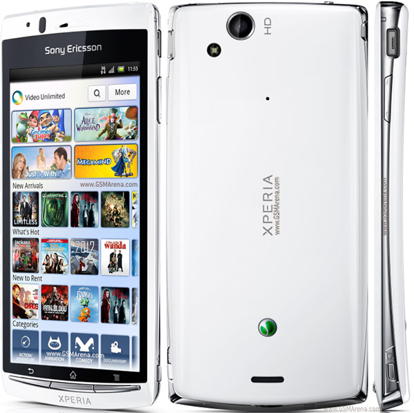
Apart from the incoherent delight that I was expressing from playing around with this phone, the reasons why I was attracted to this particular phone out of all the other flashier smartphones, was that there was something slightly slick and at the same time masculine-looking about its overall design. It's not a massive phone, unlike the current ones I've been seeing on other students, which are more or less the surface dimension of a brick. You turn it on by the button on its top right corner (referring to the image in the middle), which you can press to lock the phone as well. The three surface buttons are intricate yet the symbols above it are explanatory - the house means that you go to the home/main menu, default menu; the left button with the u-turning arrow is obviously the Back button on whatever sub-menu you go in to; the right one with the four horizontal lines also indicated that this was like a right-click for extra options. The touchscreen menu itself is easy to use and the symbols on the menu are universal enough to tell you what applications you have installed i.e Facebook, YouTube, Google, Settings, Alarm Clock. It's very simple in its design, yet very slick. Those are my first impressions anyway.
I take issue, however, with its low memory space. You can't install that many more apps onto it, which is somewhat disappointing, due to the amount of forums and media outlets that I'm subscribed to, which makes extra games a bit of a no-go as well, sadly. There are also apps that won't perform very well, mainly because it's an Android phone, but I imagine that's the same issue of compatibility with every other mobile operating system.
A lot of these phones tend to be a bit of a two-handed job, whereas I've found that I can use my thumb while the phone rests in the palm of my hand. Whether or not it was meant to give off that impression I don't know; whether or not that it may perpetuate a speedy road to arthritis I'm not sure either. Come back to me about that in a decade or two.
Overall, it is a sharp design and one that's been durable so far (give it another year and I might upgrade due to boredom and access to income). This is already a step up to the free Blackberry I got a couple of years back. The only appeal of the Blackberry was that it was free; I'm glad I lost it. That phone is meant for tiny hands.

Tuesday 12 November 2013

Various research sources into Interactive Media

Some lesson ago, I gathered a multitude of research material. So, I'm running them by briefly (just so that I can actually refer back to them at a glance):

'Reactable'
A strange, touchable instrument that emphasised concept more than technology. You can move the objects around and create different soundscapes.

'HideOut' - Augmented Reality Books, research conducted by Disney
This research project endeavour explores how mobile projectors interact with other surfaces, which reaches into the game projection paradigm.

'The World That Was' interactive table - based at the Los Angeles Museum of the Holocaust
This is the one I found most interesting, as we were presented with a collaborative project that involved the design and development of an interactive information kiosk, revolving around the UK riots that happened in the 19th century (more on that in the next entry).

Historic Duxford, Living and Working in Duxford - Interactive projection map
As part of the History of Duxford project designed by Met Studios, Heritage Interactive developed two displays for IWM Duxford. This being one of them which incorporated people's own experiences.

Snibbe Interactive was also mentioned in this lesson, and I've long been aware of Scott Snibbe and the influential hand he's had in interactive media and art. Snibbe Interactive is one of the two companies he founded for the purpose of building immersing installations (the other one being Scott Snibbe Studio - developing apps). Scott Snibbe was another initial inspiration and relevance to my project proposal, which I will highlight in a separate article.


Thursday 7 November 2013

Aestheticodes

I almost completely forgot about this one. After one of the initial workshops along with Film/Animation, Puppetry and such, there was a following lecture in one of the Bonington theaters by researchers from Horizon.
This particular talk revolved around Aestheticodes, a visual recognition application for smart phones (from my initial experience of downloading it during the lecture). It functions like QR code, yet for more visual objects rather than barcode. I was not initially receptive at first, which I thought was because it might still be early and raw for people to pick up on, but it was really just because I had an Android phone (Sony Ericsson - Xperia). However, downloading and trying it on my girlfriend's iPhone had better results. I did a few of these quick doodles to have another go at it:


The dots in their respective regions served as the code for the application to recognise, and thus linked me to whatever webpage I had set it at. The question this raises for me here is how universal will the code be in terms of linking one to certain information. Will the QR code truly work in the aesthetic sense as well? It's a big challenge to the barcode matrix system, but I think when it matures further the results will be more interesting and popular.

The Blogger thing isn't letting me embed the YouTube interview with the chaps from Horizon, so here's a direct linky; otherwise, it's at the bottom of the Aestheticodes project page.

How this relates to my project is still something to ponder over in terms of the intricacy applied to audience engagement. Perhaps in an exhibition setting people could scan and get more online information that might for some reason not be in the gallery if I applied a unique code to the artwork or on the tags, but then the problem with that is that not everyone would have a smartphone... or heard of Aestheticodes. Again, a matter of gradual popularity.

Monday 4 November 2013

Dawkins and Flash.

Oh, look! I've been quiet again. Highlight of the internet today: I was reading with some amusement about Richard Dawkins and his recent encounter with airport security in The Independent. They confiscated his honey, which means Bin Laden has finally triumphed. I found this Flash game made in response shortly after: Richard Dawkins: Honey Defender.


It was made by Tom Scott in five hours using Flash programming and sound samples of his voice. "MMM, DELICIOUS!" You have to avoid the religious folk and the zombified airport security man, unless, like me, you're further amused by the angry Dawkins hashtagged tweets that pop up. I'm hoping that when I finish this course, I'll know enough about Flash programming to be making witty and topical Flash games like this on a whim.